Roku mobile app
- Roku Community
- :
- Streaming Players
- :
- Roku mobile app
- :
- Re: iOS app background reset / unable to change af...
- Subscribe to RSS Feed
- Mark Topic as New
- Mark Topic as Read
- Float this Topic for Current User
- Bookmark
- Subscribe
- Mute
- Printer Friendly Page
- Mark as New
- Bookmark
- Subscribe
- Mute
- Subscribe to RSS Feed
- Permalink
- Report Inappropriate Content
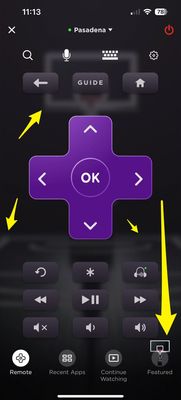
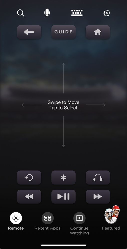
After the latest iOS 17.2.1 upgrade, my Roku app is now showing a horribly distracting and ad-centered background. Making things even worse, is the "Featured" link in the app dock. It seems the two of these are related, definitely unwanted, and seemingly impossible to remove.
Can someone please share how to return my iOS remote app to it's previous state? I am actively looking at replacement app options because I am so upset about this change, which has no setting to offset.

Assistance sought.
-Jadik
Accepted Solutions
- Mark as New
- Bookmark
- Subscribe
- Mute
- Subscribe to RSS Feed
- Permalink
- Report Inappropriate Content
- Mark as New
- Bookmark
- Subscribe
- Mute
- Subscribe to RSS Feed
- Permalink
- Report Inappropriate Content
many thanks for listening & responding to your community!
- Mark as New
- Bookmark
- Subscribe
- Mute
- Subscribe to RSS Feed
- Permalink
- Report Inappropriate Content
Re: iOS app background reset / unable to change after update
@jadik I have the same intrusive background and “Featured” link in the dock. It makes the controls difficult to distinguish. I’ve been searching for an option to disable them to no avail.
The App was great as it was Roku, please add an option for the original solid black background.
- Mark as New
- Bookmark
- Subscribe
- Mute
- Subscribe to RSS Feed
- Permalink
- Report Inappropriate Content
Re: iOS app background reset / unable to change after update
Hello! @jadik, @ravensrku,
A friendly welcome from the Roku Community!
We appreciate you reaching out to us about your feedback. No worries, we'll share it with the team.
Please do not hesitate to let us know if you have any additional feedback.
Thanks,
Arjiemar
Roku Community Moderator
- Mark as New
- Bookmark
- Subscribe
- Mute
- Subscribe to RSS Feed
- Permalink
- Report Inappropriate Content
Re: iOS app background reset / unable to change after update
this is terrible UX look and functionality
fix or I too will find an alternate app
- Mark as New
- Bookmark
- Subscribe
- Mute
- Subscribe to RSS Feed
- Permalink
- Report Inappropriate Content
Re: iOS app background reset / unable to change after update
Hi, @BiggestDaddy
Thanks for posting, and we applaud you for joining the Roku Community.
Rest assured that your concern has been acknowledged and we would be more than glad to forward this information to the appropriate Roku team for review and consideration.
Once again, we appreciate your feedback regarding this. We value your input, and your satisfaction is valuable to us.
If there's anything we can do to assist, please let us know.
All the best,
Kash
Roku Community Moderator
- Mark as New
- Bookmark
- Subscribe
- Mute
- Subscribe to RSS Feed
- Permalink
- Report Inappropriate Content
The black background is back on the App, thanks Roku! 👍
- Mark as New
- Bookmark
- Subscribe
- Mute
- Subscribe to RSS Feed
- Permalink
- Report Inappropriate Content
many thanks for listening & responding to your community!
- Mark as New
- Bookmark
- Subscribe
- Mute
- Subscribe to RSS Feed
- Permalink
- Report Inappropriate Content
Re: iOS app background reset / unable to change after update
They didn’t listen to anyone, it’s back but a football stadium this time. I’m going to find a new streaming device at this point.
- Mark as New
- Bookmark
- Subscribe
- Mute
- Subscribe to RSS Feed
- Permalink
- Report Inappropriate Content
Re: iOS app background reset / unable to change after update
Hi @uyidcle,
A warm welcome here in the Roku Community!
We're sorry for the inconvenience and and we value your opinions regarding this change. Rest assured that this will get through the concerned team for further review.
Best regards,
Rey
Roku Community Moderator
- Mark as New
- Bookmark
- Subscribe
- Mute
- Subscribe to RSS Feed
- Permalink
- Report Inappropriate Content
Re: iOS app background reset / unable to change after update
@RokuERey said:
We're sorry for the inconvenience and and we value your opinions regarding this change. Rest assured that this will get through the concerned team for further review.
This *change* has been addressed and fixed before, did you read the comments above @uyidcle's post? The background and featured button are distracting and make the remote control buttons difficult to distinguish.
The App was great as it was Roku, please add an option for the original solid black background or bring it back - again!
Become a Roku Streaming Expert!
Share your expertise, help fellow streamers, and unlock exclusive rewards as part of the Roku Community. Learn more.


