Features, settings & updates
- Roku Community
- :
- Streaming Players
- :
- Features, settings & updates
- :
- Re: How to change Roku home screen app display fro...
- Subscribe to RSS Feed
- Mark Topic as New
- Mark Topic as Read
- Float this Topic for Current User
- Bookmark
- Subscribe
- Mute
- Printer Friendly Page
- Mark as New
- Bookmark
- Subscribe
- Mute
- Subscribe to RSS Feed
- Permalink
- Report Inappropriate Content
Re: How to change Roku home screen app display from 4 columns back to 3
" they don't care for being locked into the Apple universe."
If you are using it as a streaming box, how would you be locked into the Apple universe? It has many of the same apps available as the Roku and others.
- Mark as New
- Bookmark
- Subscribe
- Mute
- Subscribe to RSS Feed
- Permalink
- Report Inappropriate Content
Re: How to change Roku home screen app display from 4 columns back to 3
@jimsz wrote:" they don't care for being locked into the Apple universe."
If you are using it as a streaming box, how would you be locked into the Apple universe? It has many of the same apps available as the Roku and others.
It is similar to Roku, in that you can only install apps approved by Apple and available via iTunes store. For Android based devices, you can install anything that is made available via an APK installation file, assuming you've enabled the developer option in the menu.
Not everyone likes being locked into a single environment. Apple does it, Roku does it (although they permit far more in their channel store), but companies like Microsoft and Google permit far more control of your devices.
Roku Community Streaming Expert
Help others find this answer and click "Accept as Solution."
If you appreciate my answer, maybe give me a Kudo.
I am not a Roku employee, just another user.
- Mark as New
- Bookmark
- Subscribe
- Mute
- Subscribe to RSS Feed
- Permalink
- Report Inappropriate Content
Re: How to change Roku home screen app display from 4 columns back to 3
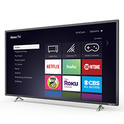
I messaged Roku as suggested on here and actually got a human respondong in real time. Great news! Its about to be fixed in the next update including the options to remove continue watching and switch between 4 and 3 tiles across! Here is Rokus reply:
"Hi there. Thanks for reaching out for support today. We also would like to thank you for the feedback regarding the new feature that has been applied on the Roku platform. The next Roku update will be focused on the user-preference interface, in which you would have the option to go back to the 3-column channel tile and hide or disable the "continue watching" section.
We are still finalizing its release. You can check for future updates at roku.com/blog. We always aim for a better streaming experience here on Roku. 💜"
- Mark as New
- Bookmark
- Subscribe
- Mute
- Subscribe to RSS Feed
- Permalink
- Report Inappropriate Content
Re: How to change Roku home screen app display from 4 columns back to 3
Agreeing and echoing what everybody else you’re saying. I hate the four tile layout. I have quite a large size Roku TV, and the tiles are still too small on this. This is frustrating and annoying. Please take us back to the three tiles or give us an option.
- Mark as New
- Bookmark
- Subscribe
- Mute
- Subscribe to RSS Feed
- Permalink
- Report Inappropriate Content
Re: How to change Roku home screen app display from 4 columns back to 3
They claim the change is coming in the "next update". That sounded good until I realized.... the last official update was in MAY! God knows how long this will take!
Again, the "middle of the night" sneaky change that took it to this terrible layout apparently was NOT an update! So why do we have to wait for an update to change it back?
This layout = Terrible!
- Mark as New
- Bookmark
- Subscribe
- Mute
- Subscribe to RSS Feed
- Permalink
- Report Inappropriate Content
Re: How to change Roku home screen app display from 4 columns back to 3
I don't believe for a moment Roku is going to switch back to three tiles or give people the option. They were able to push the four tiles out and they were whim, There's no reason they should have to wait for an update to the OS In order to put it back to three tiles. Roku is simply playing those who have purchased their product. With all the cumbersome and annoying changes they have added none of them have been for the betterment or convenience of the user it's all been to collect info or steer people to something they are getting paid additionally for.
Wait and see at some point there's going to be apps that are pushed to users home screen or certain apps that will only be allowed to be in the first or second role as a premium spot.
- Mark as New
- Bookmark
- Subscribe
- Mute
- Subscribe to RSS Feed
- Permalink
- Report Inappropriate Content
Re: How to change Roku home screen app display from 4 columns back to 3
@jimsz wrote:I don't believe for a moment Roku is going to switch back to three tiles or give people the option. They were able to push the four tiles out and they were whim, There's no reason they should have to wait for an update to the OS In order to put it back to three tiles.
What possible benefit would Roku gain by doing so? How would that provide any value to the company? You really think they're going to do something that makes some users unhappy, simply because they can? That makes no sense.
And they have already rolled the 4x4 back on many users devices. That's been verified here by many users. Why they haven't done it for everyone, we don't know. Perhaps a glitch in the software, perhaps something else. But Roku has confirmed numerous times that there will be a user setting for the display grid.
Roku Community Streaming Expert
Help others find this answer and click "Accept as Solution."
If you appreciate my answer, maybe give me a Kudo.
I am not a Roku employee, just another user.
- Mark as New
- Bookmark
- Subscribe
- Mute
- Subscribe to RSS Feed
- Permalink
- Report Inappropriate Content
Re: How to change Roku home screen app display from 4 columns back to 3
@atc98092 wrote:
@jimsz wrote:I don't believe for a moment Roku is going to switch back to three tiles or give people the option. They were able to push the four tiles out and they were whim, There's no reason they should have to wait for an update to the OS In order to put it back to three tiles.
What possible benefit would Roku gain by doing so? How would that provide any value to the company? You really think they're going to do something that makes some users unhappy, simply because they can? That makes no sense.
And they have already rolled the 4x4 back on many users devices. That's been verified here by many users. Why they haven't done it for everyone, we don't know. Perhaps a glitch in the software, perhaps something else. But Roku has confirmed numerous times that there will be a user setting for the display grid.
What benefit to Roku? Additional income.
They have spent the last couple months doing things to make users unhappy. Forced search bar, continue viewing row, forced items in menu, 4 row grid.
Roku can confirm anything but why wait for an update when it was easily pushed on users, why not simply remove it by pulling it back?
Roku burned users with these changes and took a lot of the goodwill they built up for years.
All I know is I have 4 different Rokus attached to TVs and have another 2 TVs with roku OS built in and all of them are still on the 4 row grid. All of them have had forced changes without warning.
- Mark as New
- Bookmark
- Subscribe
- Mute
- Subscribe to RSS Feed
- Permalink
- Report Inappropriate Content
Re: What’s with the new layout
I don't use Fire. This is one of the reasons I don't. Make home screen layout an option.
- Mark as New
- Bookmark
- Subscribe
- Mute
- Subscribe to RSS Feed
- Permalink
- Report Inappropriate Content
Re: How to change Roku home screen app display from 4 columns back to 3
@jimsz wrote:What benefit to Roku? Additional income.
Additional income? By irritating customers? That isn't logical. If they did it on purpose, many users would switch from a Roku to some other device. There's plenty to choose from, including some very inexpensive Android based players. You don't generate additional income by making your core customers unhappy.
Roku Community Streaming Expert
Help others find this answer and click "Accept as Solution."
If you appreciate my answer, maybe give me a Kudo.
I am not a Roku employee, just another user.
Become a Roku Streaming Expert!
Share your expertise, help fellow streamers, and unlock exclusive rewards as part of the Roku Community. Learn more.


