Features, settings & updates
- Roku Community
- :
- Streaming Players
- :
- Features, settings & updates
- :
- Re: Remove "Categories" and "Browse" from Home Scr...
- Subscribe to RSS Feed
- Mark Topic as New
- Mark Topic as Read
- Float this Topic for Current User
- Bookmark
- Subscribe
- Mute
- Printer Friendly Page
- Mark as New
- Bookmark
- Subscribe
- Mute
- Subscribe to RSS Feed
- Permalink
- Report Inappropriate Content
Re: Remove "Categories" and "Browse" from Home Screen
The 'contact us' has no way of sending complaints or suggestions. Useless.
- Mark as New
- Bookmark
- Subscribe
- Mute
- Subscribe to RSS Feed
- Permalink
- Report Inappropriate Content
Re: Remove "Categories" and "Browse" from Home Screen
One would hope that 30+ pages of hate would generate some kind of response and/or action.
- Mark as New
- Bookmark
- Subscribe
- Mute
- Subscribe to RSS Feed
- Permalink
- Report Inappropriate Content
Re: Remove "Categories" and "Browse" from Home Screen
They brought the channel numbers back to The Roku Channel, possibly due to all the negative posts here and elsewhere.
- Mark as New
- Bookmark
- Subscribe
- Mute
- Subscribe to RSS Feed
- Permalink
- Report Inappropriate Content
Re: Remove "Categories" and "Browse" from Home Screen
I don’t want “on now”, “categories”, “browse” or any other **bleep** on my home page. Get rid of this garbage!
- Mark as New
- Bookmark
- Subscribe
- Mute
- Subscribe to RSS Feed
- Permalink
- Report Inappropriate Content
Re: Remove "Categories" and "Browse" from Home Screen
I don't have anything new to add, but I'm extremely unhappy with ads being mixed in with the channels I've intentionally selected. I am not going to ever interact with these new options, and they make me irrationally angry every time I have to scroll by them when I'm looping through my channels.
It doesn't seem like a useful feature, so Ideally just remove it with the next OS update. At the very least make them configurable like the other content on the home screen.
- Mark as New
- Bookmark
- Subscribe
- Mute
- Subscribe to RSS Feed
- Permalink
- Report Inappropriate Content
Re: Remove "Categories" and "Browse" from Home Screen
Just adding my vote to remove this annoying homepage junk, if I want it I'll install it. Quit it Roku!
- Mark as New
- Bookmark
- Subscribe
- Mute
- Subscribe to RSS Feed
- Permalink
- Report Inappropriate Content
Re: Remove "Categories" and "Browse" from Home Screen
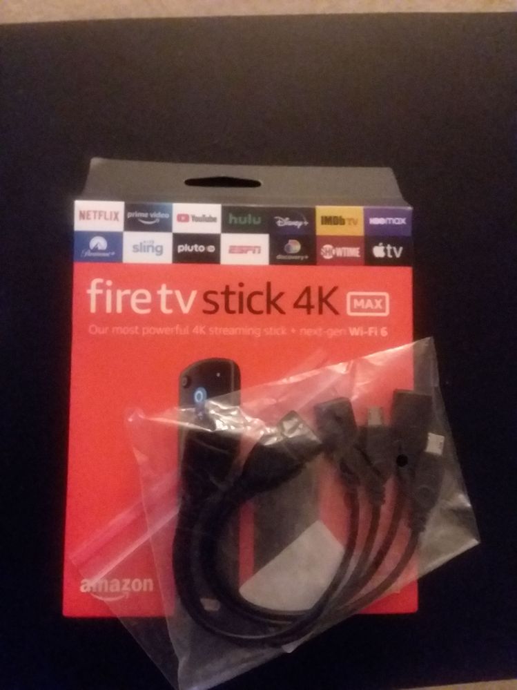
We can complain, but they seem unlikely to do anything until they notice an actual decline. I'm planning to install this Fire Stick with a code for a simple home screen. Got a cable for my flash drive too. Others here should consider taking action as well. I'll come back to Roku when the screen is cleaned up.
- Mark as New
- Bookmark
- Subscribe
- Mute
- Subscribe to RSS Feed
- Permalink
- Report Inappropriate Content
Re: Remove "Categories" and "Browse" from Home Screen
Currently looking into selling my Rokus. apps are faster on firestick anyways, the only reason why I stayed with Roku was because of the clean home, but eh they more interested on making money at the moment.
PS: I cancel the subscriptions mainly because of this **bleep**.
- Mark as New
- Bookmark
- Subscribe
- Mute
- Subscribe to RSS Feed
- Permalink
- Report Inappropriate Content
Re: "Categories and Browse" on HOME SCREEN
One of the reasons I have a device for streaming is that I am clueless about all the tech stuff, but I guess I will have to learn how to watch what I want on a large screen through my laptop or phone (which I am only just learning how to use).
Roku sold itself as freeing us from the b.s. of cable, etc. and it has become even more invasive. So very disappointing.
- Mark as New
- Bookmark
- Subscribe
- Mute
- Subscribe to RSS Feed
- Permalink
- Report Inappropriate Content
Re: Remove "Categories" and "Browse" from Home Screen
I guess I’m finally switching over to AppleTV boxes. Way to go Roku!
Become a Roku Streaming Expert!
Share your expertise, help fellow streamers, and unlock exclusive rewards as part of the Roku Community. Learn more.

