Features, settings & updates
- Roku Community
- :
- Streaming Players
- :
- Features, settings & updates
- :
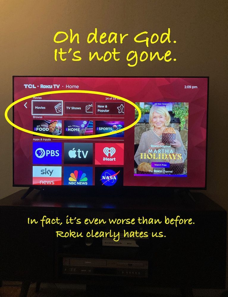
- Remove "Categories" and "Browse" from Home Screen
- Subscribe to RSS Feed
- Mark Topic as New
- Mark Topic as Read
- Float this Topic for Current User
- Bookmark
- Subscribe
- Mute
- Printer Friendly Page
- Mark as New
- Bookmark
- Subscribe
- Mute
- Subscribe to RSS Feed
- Permalink
- Report Inappropriate Content
Re: How to Remove "Categories" and "Browse" from Home Screen
1000% agree
Please STOP adding things (launch points) to the Home Screen that can't be suppressed in the setup menu. It's very aggravating and annoying to have some programmer, somewhere, altering my user experience.
We DON'T need additional launch points to access OUR content.
- Mark as New
- Bookmark
- Subscribe
- Mute
- Subscribe to RSS Feed
- Permalink
- Report Inappropriate Content
Re: How to Remove "Categories" and "Browse" from Home Screen
Hi Community users,
Warm regards from the Roku Community!
We appreciate your feedback regarding the changes you've noticed to your Home screen.
For additional consideration, we'll make sure to let the person in question know about this.
Many thanks
Rey
Roku Community Moderator
- Mark as New
- Bookmark
- Subscribe
- Mute
- Subscribe to RSS Feed
- Permalink
- Report Inappropriate Content
Re: Remove "Categories" and "Browse" from Home Screen
@Wanderglobe Interestingly enough, the "update" has disappeared from one of my Rokus. I have seven units total in the house (all streamers, no TVs), and this one is the only one where it has disappeared. I've done nothing different, it just is no longer there on this one Roku. Of note, the ONLY thing listed now in my "Shortcuts" under "Home Screen" is "Add Channels" & "TV Off." The rest of the selections have mysteriously gone missing.
- Mark as New
- Bookmark
- Subscribe
- Mute
- Subscribe to RSS Feed
- Permalink
- Report Inappropriate Content
Re: How to Remove "Categories" and "Browse" from Home Screen
This problem is all over the internet, doesn't appear ANYONE LIIKES THIS **bleep** ON THEIR SCREEN WITH NO OPTION TO MODIFY IT OR REMOVE/HIDE IT!!!!! Get rid of it or fix it!!!!
- Mark as New
- Bookmark
- Subscribe
- Mute
- Subscribe to RSS Feed
- Permalink
- Report Inappropriate Content
Re: Remove "Categories" and "Browse" from Home Screen
You own the right side of our Roku screen with ads, you have been taking the left side with ads. Please leave my app menu alone! Enough already!
- Mark as New
- Bookmark
- Subscribe
- Mute
- Subscribe to RSS Feed
- Permalink
- Report Inappropriate Content
Re: Remove "Categories" and "Browse" from Home Screen
Sad part for Roku is they won't even realize the impact until it's too late.
People just won't come back to buy more products.
- Mark as New
- Bookmark
- Subscribe
- Mute
- Subscribe to RSS Feed
- Permalink
- Report Inappropriate Content
Re: Remove "Categories" and "Browse" from Home Screen
I wish I could take credit this image but I stole it haha
- Mark as New
- Bookmark
- Subscribe
- Mute
- Subscribe to RSS Feed
- Permalink
- Report Inappropriate Content
Re: Remove "Categories" and "Browse" from Home Screen
Just adding to the din: stop cramming ads down our throats. Like many here I have all "suggested" junk disabled, as I am best qualified to decide for myself which channels and content I want to see.
Also like many here I will sell my three rokus and switch to the many, many other options for getting content onto my screen.
Sorry roku your product isn't good enough to get away with such behavior. Your customers will simply leave.
- Mark as New
- Bookmark
- Subscribe
- Mute
- Subscribe to RSS Feed
- Permalink
- Report Inappropriate Content
Re: Remove "Categories" and "Browse" from Home Screen
If you think Roku is bad, have you seen a Fire TV or Google TV home screen?
Not as sure about Apple TV, but some pics seem to show it relatively clean. But, you are going to pay an arm and leg for it.
- Mark as New
- Bookmark
- Subscribe
- Mute
- Subscribe to RSS Feed
- Permalink
- Report Inappropriate Content
Re: Remove "Categories" and "Browse" from Home Screen
And it just keeps getting worse! ...so I get home today and not only is the obnoxious and non-removable "ALL THINGS FOOD" link in my apps, but the same link is now mixed in with the menu on left side of the screen. At least that one is removable by going to Settings/Home Screen/All Things Food/ and checking 'Hide'.
They should do the same thing with all six of those obnoxious icons on the right, then get rid of them or make them removable as well.
Become a Roku Streaming Expert!
Share your expertise, help fellow streamers, and unlock exclusive rewards as part of the Roku Community. Learn more.

