Channels & viewing
- Roku Community
- :
- Streaming Players
- :
- Channels & viewing
- :
- Re: No longer highlighting the channel icons
- Subscribe to RSS Feed
- Mark Topic as New
- Mark Topic as Read
- Float this Topic for Current User
- Bookmark
- Subscribe
- Mute
- Printer Friendly Page
- Mark as New
- Bookmark
- Subscribe
- Mute
- Subscribe to RSS Feed
- Permalink
- Report Inappropriate Content
No longer highlighting the channel icons
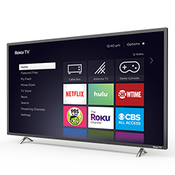
So now when I select a channel, the icon is no longer highlighted. It is not intuitive to see which selection one has made. Having to move out of the icon field to a small bit of text is poor user interface design. Can you please change back??
- Mark as New
- Bookmark
- Subscribe
- Mute
- Subscribe to RSS Feed
- Permalink
- Report Inappropriate Content
Re: No longer highlighting the channel icons
I'm also now having the same issue in one of my Roku Tv that only barely just got delivered a week ago
- Mark as New
- Bookmark
- Subscribe
- Mute
- Subscribe to RSS Feed
- Permalink
- Report Inappropriate Content
Re: No longer highlighting the channel icons
Stupidest decision ever made
- Mark as New
- Bookmark
- Subscribe
- Mute
- Subscribe to RSS Feed
- Permalink
- Report Inappropriate Content
Re: No longer highlighting the channel icons
This is driving me nuts!!! Can you can ge it in settings anywhere?
- Mark as New
- Bookmark
- Subscribe
- Mute
- Subscribe to RSS Feed
- Permalink
- Report Inappropriate Content
Re: No longer highlighting the channel icons
Thanks for the post.
Can you please specify the issue you are experiencing?
With more information we will be able to assist you further.
Thanks,
Danny
Roku Community Moderator
- Mark as New
- Bookmark
- Subscribe
- Mute
- Subscribe to RSS Feed
- Permalink
- Report Inappropriate Content
Re: No longer highlighting the channel icons
I am having the same issue. When I turn on my tv, all the channels (apps) are lined up. Each channel is a box. The boxes use to highlight when I scrolled through each one. Example: when I was scrolling through, let’s say I got to netlix (this is before you click ok to access the channel) it would be highlighted so I would know I was on that channel/app. Now I can’t tell which channel I am on. It does this weird thing now where it has txt on the top left telling what channel you are on but the actual channel/app does not show up highlight . I hope this is enough detail.
- Mark as New
- Bookmark
- Subscribe
- Mute
- Subscribe to RSS Feed
- Permalink
- Report Inappropriate Content
Re: No longer highlighting the channel icons
Also, when I say highlight I am referring to the white box that is around the channel/app when you scroll through the channels. This is only happening on my roku tv and not my roku express devices.
- Mark as New
- Bookmark
- Subscribe
- Mute
- Subscribe to RSS Feed
- Permalink
- Report Inappropriate Content
Re: No longer highlighting the channel icons
Try to "Restart" your TV from the Power settings menu or just unplug the power for a few seconds and plug it back in.
Help others find this answer and click "Accept as Solution."
If you appreciate my answer, maybe give me a Kudo.
I am not a Roku employee.
- Mark as New
- Bookmark
- Subscribe
- Mute
- Subscribe to RSS Feed
- Permalink
- Report Inappropriate Content
Re: No longer highlighting the channel icons
I changed my theme. Then went back to roku theme and it began highlighting icon again. Kinda like a reset.
- Mark as New
- Bookmark
- Subscribe
- Mute
- Subscribe to RSS Feed
- Permalink
- Report Inappropriate Content
Re: No longer highlighting the channel icons
Same problem with mine. So aggravating
Become a Roku Streaming Expert!
Share your expertise, help fellow streamers, and unlock exclusive rewards as part of the Roku Community. Learn more.

