Remotes
- Roku Community
- :
- Streaming Players
- :
- Remotes
- :
- Re: New Roku Remote Backlit - V2 Pro
- Subscribe to RSS Feed
- Mark Topic as New
- Mark Topic as Read
- Float this Topic for Current User
- Bookmark
- Subscribe
- Mute
- Printer Friendly Page
- Mark as New
- Bookmark
- Subscribe
- Mute
- Subscribe to RSS Feed
- Permalink
- Report Inappropriate Content
Re: New Roku Remote Backlit - V2 Pro
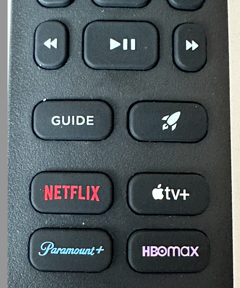
I was on the fence about the new remotes [GUIDE] and [LAUNCH] buttons replacing the assignable [1] and [2] buttons as we use them for quick access to two app/channels. The way they function though was well thought out, you can still retain quick access to two app/channels. Upon pushing the [LAUNCH] button you'll notice the two left positions on the launch pop up are assignable so that's where we put the desired app/channels. The [GUIDE] button is a bonus when watching LIVE TV. don't push it while viewing a program steam though as it'll take you out of the app/channel you were streaming. Removing the headphone jack is not missed with today's bluetooth headphone options. Hooray, USB C Charging, thank you for adopting this modern standard.
- Mark as New
- Bookmark
- Subscribe
- Mute
- Subscribe to RSS Feed
- Permalink
- Report Inappropriate Content
Re: New Roku Remote Backlit - V2 Pro
Kudos for the backlighting, but the buttons are still very hard to press, including the volume on the side which I wish were on the top. Being able to program it would be nice, particularly being able to change inputs.
I used to use a Logitech Harmony remote but since they discontinued it I guess I'm looking for a universal remote like that. 🙂
- Mark as New
- Bookmark
- Subscribe
- Mute
- Subscribe to RSS Feed
- Permalink
- Report Inappropriate Content
Re: New Roku Remote Backlit - V2 Pro
WOW, just discovered the Roku Voice Remote Pro v2 does have a [PREVIOUS CHANNEL] button. It's the, wait for it ↪️ button. At least on the new RokuTV Pro Series television running Roku OS 13.0.
*Our TCL Roku sets rewind a little in OTA, we do have USB sticks in them to pause LIVE TV.*
- Mark as New
- Bookmark
- Subscribe
- Mute
- Subscribe to RSS Feed
- Permalink
- Report Inappropriate Content
Re: New Roku Remote Backlit - V2 Pro
Any reason why one of the shortcut buttons is HBO Max instead of just Max? That platform has had its name changed for months now.
- Mark as New
- Bookmark
- Subscribe
- Mute
- Subscribe to RSS Feed
- Permalink
- Report Inappropriate Content
Re: New Roku Remote Backlit - V2 Pro
The button on my v2 Voice Remote Pro is labeled [HBOMAX].
- Mark as New
- Bookmark
- Subscribe
- Mute
- Subscribe to RSS Feed
- Permalink
- Report Inappropriate Content
Re: New Roku Remote Backlit - V2 Pro
That is another reason that these preassigned shortcut buttons are stupid and useless. If apps change their names like "HBOMax" to "Max" the new name can't update on your remote since it's physically labeled. So it will always show the old name, or if the app gets discontinued and is no longer available on Roku then that particular shortcut button is labeled with a dead app that won't work and becomes completely useless.
The four shortcut buttons shouldn't have preassigned apps that Roku decides for you, instead they should be labeled 1-4 so we can assign any app we want to each button. That would be much better for the customer, but Roku's main concern is making money from selling those shortcut buttons to companies so that they can get paid, not customer satisfaction.
- Mark as New
- Bookmark
- Subscribe
- Mute
- Subscribe to RSS Feed
- Permalink
- Report Inappropriate Content
Re: New Roku Remote Backlit - V2 Pro
This remote just came out last week so I'm curious as to why the button is still their old logo. Were these remotes designed a while ago and Roku just sat them in a warehouse until they felt it was the right time to release them? Or do they know something we don't? (Like a rebranding? Again.)
- Mark as New
- Bookmark
- Subscribe
- Mute
- Subscribe to RSS Feed
- Permalink
- Report Inappropriate Content
Re: New Roku Remote Backlit - V2 Pro
Here's how it's labeled on my v2 Roku Voice Remote Pro. . .
- Mark as New
- Bookmark
- Subscribe
- Mute
- Subscribe to RSS Feed
- Permalink
- Report Inappropriate Content
Re: New Roku Remote Backlit - V2 Pro
It's not called HBO Max and hasn't been for a while now......
Am I being trolled here by people insinuating that it's labeled correctly......lol?
Edit: nvrmnd. The post I replied to is now gone 🤷
- Mark as New
- Bookmark
- Subscribe
- Mute
- Subscribe to RSS Feed
- Permalink
- Report Inappropriate Content
Re: New Roku Remote Backlit - V2 Pro
Have read HBO-MAX still believes the HBO part has marketability, so maybe that’s why it’s there. A transition thing. It’s why there’s an HBO tab still front and center at the top of the MAX app.
Surely, HBO knew about the MAX transition long before this remote was finalized.
Become a Roku Streaming Expert!
Share your expertise, help fellow streamers, and unlock exclusive rewards as part of the Roku Community. Learn more.

