Features, settings & updates
- Roku Community
- :
- Streaming Players
- :
- Features, settings & updates
- :
- Re: How to change Roku home screen app display fro...
- Subscribe to RSS Feed
- Mark Topic as New
- Mark Topic as Read
- Float this Topic for Current User
- Bookmark
- Subscribe
- Mute
- Printer Friendly Page
- Mark as New
- Bookmark
- Subscribe
- Mute
- Subscribe to RSS Feed
- Permalink
- Report Inappropriate Content
Re: How to change Roku home screen app display from 4 columns back to 3
Echoing what everyone else has already said. The four columns is very hard to see and it’s honestly sad that Roku does not have better accessibility options to change icon and text size.
- Mark as New
- Bookmark
- Subscribe
- Mute
- Subscribe to RSS Feed
- Permalink
- Report Inappropriate Content
What’s with the new layout
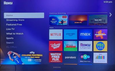
Ok so I get home today and I have a 4 grid layout on my Roku tv. I’m not gonna lay and say it’s hard to read, I mean it’s not the easiest to read, it’s just I wasn’t given the option as to if I wanted my tv changed without my permission. Now I’m all for if it’s in the settings column and I’m playing around with the design trying to see if it’s better and it’s not. How do I fix this foolishness? Help anyone.
- Mark as New
- Bookmark
- Subscribe
- Mute
- Subscribe to RSS Feed
- Permalink
- Report Inappropriate Content
Re: What’s with the new layout
This is apparently something Roku has rolled out to a handful of users. From what I've heard, there's no way to alter the settings of the grid. Judging by the complaints I've heard about it, hopefully Roku will roll it back and restore the 3x3 grid. I haven't seen it on any of my players, including some that are part of the beta test program.
Roku Community Streaming Expert
Help others find this answer and click "Accept as Solution."
If you appreciate my answer, maybe give me a Kudo.
I am not a Roku employee, just another user.
- Mark as New
- Bookmark
- Subscribe
- Mute
- Subscribe to RSS Feed
- Permalink
- Report Inappropriate Content
Re: How to change Roku home screen app display from 4 columns back to 3
This issue has just started displaying on our TV that is using Roku Ultra 4802X two days ago. (Software version 12.0.0 build 4184-C2, with an update date of May 2023). We have tried to disconnect the power for 15 minutes, but no luck. I am hoping someone will find a fix for this.
- Mark as New
- Bookmark
- Subscribe
- Mute
- Subscribe to RSS Feed
- Permalink
- Report Inappropriate Content
Re: How to change Roku home screen app display from 4 columns back to 3
To Roku tech support who are monitoring this thread: As you can see, this change to 4 columns is very irritating to customers. Some will find it useful if they have larger TVs (I have 9 Roku devices and on my larger TVs this change is awesome), but for smaller TV owners this makes Roku home screen downright unusable!!!
This should be a simple code change to provide customers in "Settings" the option to change to 4 column or 3 column (call it compact and cozy just like how Google / Microsoft / Apple etc call their email displays). Guys: This isn't rocket science, just provide customers with this option and all will be good.
There are so many things to LOVE about the Roku Ecosystem, but this type of thing really makes you guys seem bush league compared to Apple/Amazon/Google streaming devices. FIX THIS ASAP PLEASE!!!
- Mark as New
- Bookmark
- Subscribe
- Mute
- Subscribe to RSS Feed
- Permalink
- Report Inappropriate Content
Re: How to change Roku home screen app display from 4 columns back to 3
This just started happening to me too. I need, I mean NEED 3 wide. 4 wide is too small to easily read on my 32" tv. There needs to be a option ASAP allowing this. On bigger TV's it's probably ok but don't assume all your users are using 70" TV's.
- Mark as New
- Bookmark
- Subscribe
- Mute
- Subscribe to RSS Feed
- Permalink
- Report Inappropriate Content
Re: What’s with the new layout
It is random testing right now. To be honest, unless you have a very small screen, the old 3x3 grid is out of date and very huge. Most of the apps have different enough icons that you can still easily tell what is what. To be honest, it looks like the icon sizes at 4x4 are roughly the same, or maybe still a bit bigger, than a Fire TV in apps screen mode.
- Mark as New
- Bookmark
- Subscribe
- Mute
- Subscribe to RSS Feed
- Permalink
- Report Inappropriate Content
Re: How to change Roku home screen app display from 4 columns back to 3
Same here 🙂 If you find out also tell to me !
- Mark as New
- Bookmark
- Subscribe
- Mute
- Subscribe to RSS Feed
- Permalink
- Report Inappropriate Content
Re: How to change Roku home screen app display from 4 columns back to 3
Some genius at Roku thought this would be a "great idea", but it isn't. Please either put the three tile interface back or add a config option to allow the three tile interface. Otherwise, as a visually impaired individual I will have to find a different streaming device because the smaller tiles are unusable.
- Mark as New
- Bookmark
- Subscribe
- Mute
- Subscribe to RSS Feed
- Permalink
- Report Inappropriate Content
Re: What’s with the new layout
Any one know if they will fix this we can't see whole screen on TV now. Can't see side menu on side or even read full descriptions about the movies. If they don't fix yhis soon we'll be looking for new device.
Become a Roku Streaming Expert!
Share your expertise, help fellow streamers, and unlock exclusive rewards as part of the Roku Community. Learn more.
