Features, settings & updates
- Roku Community
- :
- Streaming Players
- :
- Features, settings & updates
- :
- Re: REMOVE recommended for you on roku home screen
- Subscribe to RSS Feed
- Mark Topic as New
- Mark Topic as Read
- Float this Topic for Current User
- Bookmark
- Subscribe
- Mute
- Printer Friendly Page
- Mark as New
- Bookmark
- Subscribe
- Mute
- Subscribe to RSS Feed
- Permalink
- Report Inappropriate Content
Re: REMOVE recommended for you on roku home screen
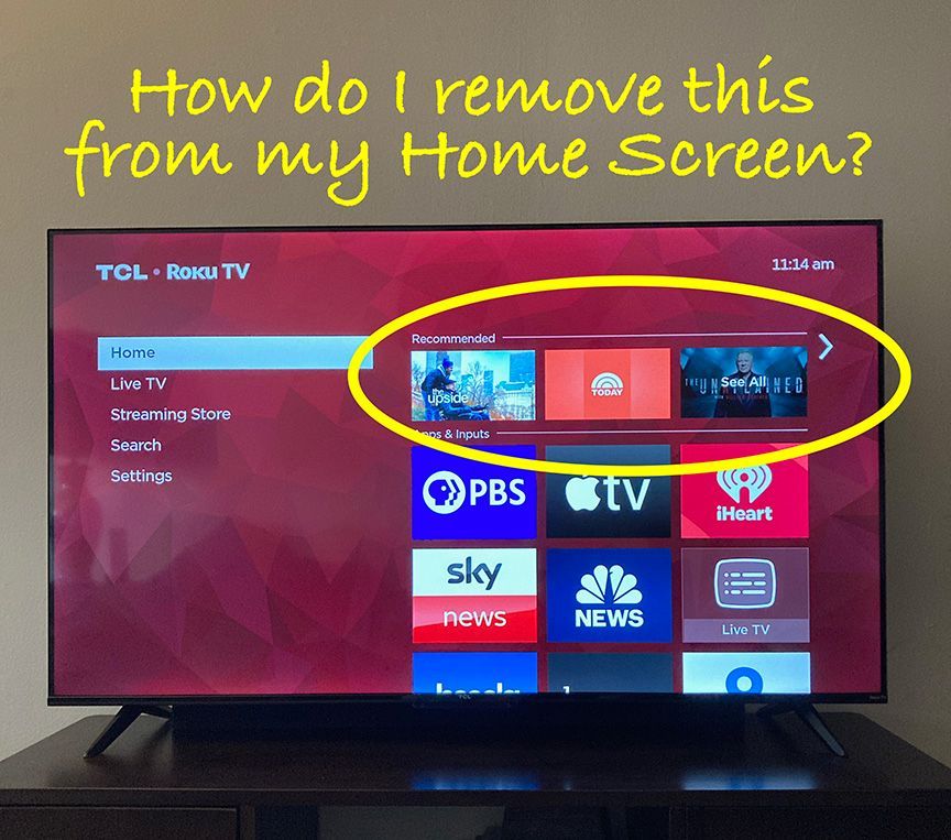
This is about that new Recommended row above Apps right? The one that links to What to Watch even though I have that pivot disabled in the left-nav?
Please let us remove it. It's just more clutter, poor UX, and reduces my desire to continue recommending Roku products to friends and family when you take away control from users.
To make matters worse, because it cannot be restricted with Parental Controls, my toddler is now able to start any show that happens to be currently promoted. If it's not safe for my kids to use, it's getting replaced, and I cannot possibly recommend it to other parents.
- Mark as New
- Bookmark
- Subscribe
- Mute
- Subscribe to RSS Feed
- Permalink
- Report Inappropriate Content
Re: REMOVE recommended for you on roku home screen
This feature makes the home screen look incredibly cluttered, and it is annoying. The titles they recommend are not anything I would watch. I reached out to support who said it is part of the update and that they appreciate the feedback. The clean home screen is the reason I chose Roku in the first place. I will be trying an alternative for the next couple of weeks, and depending on how that goes/whether Roku gets rid of this feature, I may end up unplugging the Roku altogether.
- Mark as New
- Bookmark
- Subscribe
- Mute
- Subscribe to RSS Feed
- Permalink
- Report Inappropriate Content
Re: REMOVE recommended for you on roku home screen
Roku seems to believe that your customers don't have a choice but to be the target of ever increasing and intrusive Roku advertising. You are wrong.
With the forced addition of even more advertising on something that used to have little or none, Roku has now reached a tipping point where it is no longer a decent or desirable product. Once a tipping point has been reached it can take years for the company to understand what they've done. It's already too late to backtrack.
I've purchased easily a dozen Roku devices for my self and for gifts, and the people I've purchased for have purchased even more, but the ens**tification of your platform brings my years of use and recommending it to an end. From now on I'll be doing the opposite - telling people not to buy Roku products under any circumstances.
Good riddance Roku.
- Mark as New
- Bookmark
- Subscribe
- Mute
- Subscribe to RSS Feed
- Permalink
- Report Inappropriate Content
Re: REMOVE recommended for you on roku home screen
This is so irritating. I am a long time user and this sh*t feels forced. The right side panel ads are already annoying, but the top row that defaults my selection to recommended is just on another level. I hope this removed, otherwise replacement to Apple TV will be fairly quick.
- Mark as New
- Bookmark
- Subscribe
- Mute
- Subscribe to RSS Feed
- Permalink
- Report Inappropriate Content
Re: REMOVE recommended for you on roku home screen
Purchased a fire stick due to the Recommended spam on the home screen. Put the roku in the trash. Bye bye!
- Mark as New
- Bookmark
- Subscribe
- Mute
- Subscribe to RSS Feed
- Permalink
- Report Inappropriate Content
Re: REMOVE recommended for you on roku home screen
Thanks for your post, @tecweasel. I feel your pain. This obnoxious new "feature" suddenly polluted the home screen of my 50" TCL Roku TV last Wednesday, November 22.
I did not ask for it. I do not want it. Roku seems to have shoved it at me without asking for permission to do so. I do not want Roku's recommendations about anything.
I've searched every setting trying to find a way to remove it. No joy. Hours of my life melted away and I'll never get them back.
This could be a tipping point in my relationship with Roku. This TV is my personal property — not a playground for Roku's marketing goals.
- Mark as New
- Bookmark
- Subscribe
- Mute
- Subscribe to RSS Feed
- Permalink
- Report Inappropriate Content
Re: REMOVE recommended for you on roku home screen
"This TV is my personal property — not a playground for Roku's marketing goals."
Well put! I feel exactly the same way! We pay for these Roku devices and we should not have any new junk 'features' forced on us without the ability to hide them!
Adding extra stuff like this is fine, as long as they include options in the settings to completely disable them! Which they've failed to do. The only thing I want to see on my Roku Home Screen is my Channel/App tiles!
Now I have movies and shows popping up in a "Continue Watching" row on my home screen of things under "Continue Watching" in the The Roku Channel app! This is completely ridiculous that Roku thinks I want this crammed onto my home screen!
The only way to remove the titles from the home screen is to remove them from continue watching and that also removes them from the "Continue Watching" row within The Roku Channel app itself, which is the one place where I actually do want to see my "Continue Watching" progress!
The people at Roku who designed these new annoyances that they think are useful features are completely out of touch with what customers want! Even if they listen to our negative feedback and remove all of this junk from showing up on the home screen or they give us the ability to hide it ourselves I bet it will takes months before it happens!
Roku, don't design new features unless you also have designed new settings for users to turn them off at the same time! This way anyone who hates your additions can shut them off and we won't have to waste our time complaining here! Use some common sense!
- Mark as New
- Bookmark
- Subscribe
- Mute
- Subscribe to RSS Feed
- Permalink
- Report Inappropriate Content
Re: REMOVE recommended for you on roku home screen
Hmmm. Glad to hear that it's gone on your end. Congratulations! Sadly for me on Friday, November 24, 2023.
- Mark as New
- Bookmark
- Subscribe
- Mute
- Subscribe to RSS Feed
- Permalink
- Report Inappropriate Content
Re: REMOVE recommended for you on roku home screen
Thanks, RokuCarly, but platitudes aren't particularly helpful. Please consider escalating this issue to someone higher up on the Roku corporate food chain... someone who's probably working well above your pay grade. For example, maybe you can pass this issue along to a billionaire named Anthony Wood. Based on a recent search, I believe he's the CEO of Roku.
- Mark as New
- Bookmark
- Subscribe
- Mute
- Subscribe to RSS Feed
- Permalink
- Report Inappropriate Content
Re: REMOVE recommended for you on roku home screen
"maybe you can pass this issue along to a billionaire named Anthony Wood. Based on a recent search, I believe he's the CEO of Roku."
Great suggestion! However the problem is billionaire CEOs don't care about little stuff like this! They instruct their corporate minions to handle (or not handle in this case) these issues while they play golf all day and have expensive early lunches when they aren't in board meetings.
Become a Roku Streaming Expert!
Share your expertise, help fellow streamers, and unlock exclusive rewards as part of the Roku Community. Learn more.


