Features, settings & updates
- Roku Community
- :
- Streaming Players
- :
- Features, settings & updates
- :
- Remove the big search box from Roku home screen
- Subscribe to RSS Feed
- Mark Topic as New
- Mark Topic as Read
- Float this Topic for Current User
- Bookmark
- Subscribe
- Mute
- Printer Friendly Page
- Mark as New
- Bookmark
- Subscribe
- Mute
- Subscribe to RSS Feed
- Permalink
- Report Inappropriate Content
Re: Remove the big search box from Roku home screen
- Mark as New
- Bookmark
- Subscribe
- Mute
- Subscribe to RSS Feed
- Permalink
- Report Inappropriate Content
Re: Remove the big search box from Roku home screen
The deaded search bar just showed up today. I kept trying to get rid of it. What **bleep** idea. Hope they move off the top like that, how annoying.
- Mark as New
- Bookmark
- Subscribe
- Mute
- Subscribe to RSS Feed
- Permalink
- Report Inappropriate Content
Re: Remove the big search box from Roku home screen
Thanks for posting the screenshot. Appreciate it.
Have you looked under Settings/Home Screen to see if there an option to Show or Hide this feature similar to other Home Screen feature settings?
-----
Roku sometimes tests different features out on users' devices. So not yet sure if this is a build update coming to all OS 12 devices, or some of you have been "lucky" to have been unwittingly chosen to participate in their testing.
Unfortunately, Roku does keep messing with the Search features and I am not really sure who they are soliciting info from that keeps giving positive feedback to these changes (if this is what it is). I can certainly see the annoyance of having to navigate past the Search bar (especially if located in top row), since most people put their most used channel/app there for quick access. (not to mention those of us users who have tried to set up Roku screens for elderly users to be as painless as possible). Even an additional navigation press of the remote is enough to confuse them.
Just another Roku user... I am not a Roku employee.
Insignia RokuTV, Ultra 4660, 4802, 4850, Premiere+ 3921, Express 4k+ 3941, Streambar 9102
- Mark as New
- Bookmark
- Subscribe
- Mute
- Subscribe to RSS Feed
- Permalink
- Report Inappropriate Content
Re: Remove the big search box from Roku home screen
Have you looked under Settings/Home Screen to see if there an option to Show or Hide this feature similar to other Home Screen feature settings?
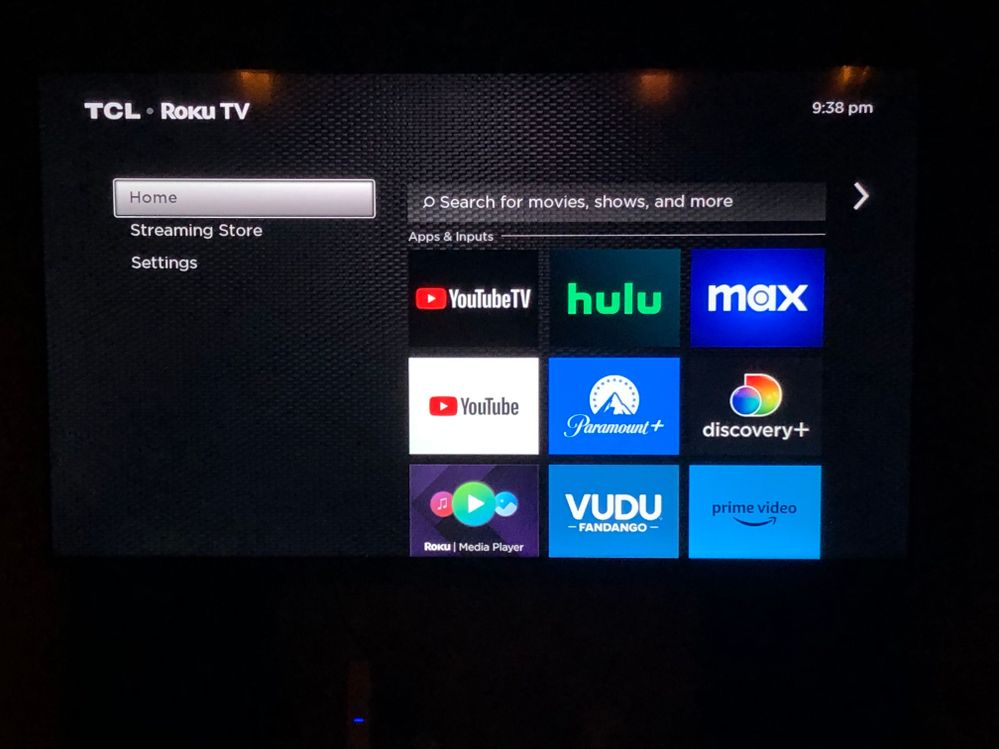
I sure have. In fact it you notice in the screen shot pretty much everything that can be turned off is turned off. Just Home, Settings and Streaming Store remain.
And if I could turn off Streaming Store I most surely would. 😁
- Mark as New
- Bookmark
- Subscribe
- Mute
- Subscribe to RSS Feed
- Permalink
- Report Inappropriate Content
Re: Remove the big search box from Roku home screen
I did notice that but wasn't sure if that was a result of this issue or if you had turned them all off.
In some cases, whenever there is an issue with an update (corrupted), users find they are missing some of the menu items.
I am almost thinking Roku did this Search feature change because of all the nonsense that has taken over the left side menu. It used to be nice and clean and now is cluttered with all these menu items (many of which are duplicated in other areas on the Roku platform.)
In the past, due to OS limitations Roku would actually disable a menu item to make room for a promo/special feature. (basically temporarily replace the menu item). Now they found a way to just keep adding to the List.
Just another Roku user... I am not a Roku employee.
Insignia RokuTV, Ultra 4660, 4802, 4850, Premiere+ 3921, Express 4k+ 3941, Streambar 9102
- Mark as New
- Bookmark
- Subscribe
- Mute
- Subscribe to RSS Feed
- Permalink
- Report Inappropriate Content
Re: Remove the big search box from Roku home screen
What the appropriate location for direct feedback to Roku about this? It’s incredibly annoying that the selector automatically goes to search - something I will never use and there is no way to disable it. I don’t care if it exists but there really should be an option to toggle it off.
- Mark as New
- Bookmark
- Subscribe
- Mute
- Subscribe to RSS Feed
- Permalink
- Report Inappropriate Content
Hi everyone!
Some users may see a Search Bar at the top of their home screen to improve navigation and content discovery and get you into your streaming content as soon as you turn on your TV. This feature is only displaying on a subset of devices at this time.
It isn't possible to hide this Search Bar, but you can customize other parts of your left navigation column by going to Home > Settings > Home screen and taking a look at the options there.
This is a great place to leave your feedback for the Home Screen Search Bar, and we'll ensure the product team sees it.
Thank you!
Help others find this answer and click "Accept as Solution."
If you appreciate my answer, maybe give me a Kudo.
- Mark as New
- Bookmark
- Subscribe
- Mute
- Subscribe to RSS Feed
- Permalink
- Report Inappropriate Content
Re: Remove the big search box from Roku home screen
@RokuAustin Please do not move forwards with this proposed new feature and cancel the test, it is not an improvement, it is a horrible degradation to the user experience. A search bar just slows down people who know what they want to do by adding extra clicks to scroll the cursor past the search bar. Additionally, your search bar is not useful for many people who use Roku as their cable box like with the Xfinity app to avoid cable box equipment fees (still sucks that you can’t use a universal remote to change the channel).
At a minimum, have a way to opt out of this kind of beta testing or add the setting for disabling the specific test functionality at the same time as you start the test.
Some much better features for you to test and move forwards with are settings that allow people to set the cursor to start on the first application tile on the home screen instead of on the Roku left side menu bar. Another would be allowing users to set an input or application that is automatically launched whenever the device (or TV the device is connected to) powers on.
- Mark as New
- Bookmark
- Subscribe
- Mute
- Subscribe to RSS Feed
- Permalink
- Report Inappropriate Content
Re: Remove the big search box from Roku home screen
This is absolutely infuriating. The search bar SHOULD NOT be the FIRST thing highlighted on the home screen! Thus stupid update forces you to press an extra button EVERY SINGLE TIME YOU USE YOUR TV!
This is completely unacceptable and needs to be reversed IMMEDIATELY.
Move the search bar to the bottom or place it on the left-side menu. DO NOT place it in the way of the regular TV functions!
- Mark as New
- Bookmark
- Subscribe
- Mute
- Subscribe to RSS Feed
- Permalink
- Report Inappropriate Content
Re: Remove the big search box from Roku home screen
Extra clicks never improves navigation. It degrades user interaction/navigation for existing users since they've already learned their way around and have their favorite apps at the top. It's okay if it's on this screen, but it really belongs with the "Add Channels" and "TV Off" buttons, not forcing users through additional navigation they didn't have before.
Please remove it from the first option from the Home Screen and relocate it elsewhere not in the normal user flow (or perhaps my normal flow). Have you ever surveyed how users use the device?
Arguably, Search belongs on the "What to Watch" screen since Searching is what one is doing on that screen, Searching for What to Watch.
Become a Roku Streaming Expert!
Share your expertise, help fellow streamers, and unlock exclusive rewards as part of the Roku Community. Learn more.


